Blog
Building a new data visualization: from basic to brilliant!

March 15, 2023


At Biobot, we are constantly iterating on how we present our COVID-19 wastewater data. We experiment with different types of analyses and visualizations to make sure that what we put out into the world reflects our latest understanding of the data, so that it can best help drive public health decision-making and increase awareness of the current state of the Covid-19 pandemic.
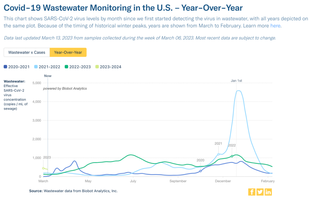
Getting to a plot that we publish and share regularly requires a lot of iteration and collaboration across teams, from data science to design. We recently introduced a new type of visualization to our public dashboard that compares year-over-year COVID-19 wastewater levels, showing wastewater concentrations throughout each year of the COVID-19 pandemic. This plot lets you easily compare our current wastewater levels with levels at the same time in 2022, 2021, and 2020.
Getting to this final version involved several rounds of design iteration, which we’re highlighting here as an example of how to build impactful data visualizations.
Step 1: Make the initial plot
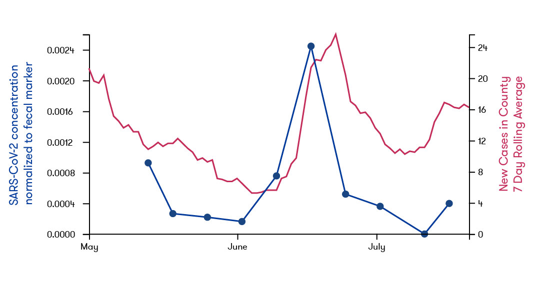
It all starts with a question. For instance, “I wonder how today’s COVID-19 levels compare to levels this time last year?”— then the fun begins.
Before we can make a plot, we first have to decide what data to include in our analysis and how to preprocess it. For example: do we want to include all wastewater treatment plants, or just the ones above a certain population size? Does it make more sense to look at averaged weekly data, or should we show daily raw data instead?
Second, we need to figure out what kind of plot makes the most sense: should we use a heatmap to show many variables all at the same time, or is a line plot better to keep things simple?
Finally, we plot! At this stage in the process, the plots aren’t usually very pretty — they’re typically made with the standard defaults of your plotting code, the axes and labels aren’t stylized, and there’s just some bare-bones prototype of potential formatting. But, an initial plot prototype is enough to inform a decision on whether or not we want to polish it for public-facing consumption. We know we have a good plot when things suddenly click: we visualize the data in a certain way, and suddenly a totally new understanding of what’s going on is unlocked!
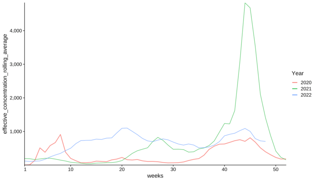
After making this plot comparing SARS-CoV-2 levels for the past 3 years, we realized: holy cow! Levels in 2022 were higher than the Delta peak (as seen by the green line peak before the ‘30’ on the x-axis), and our Winter “wave” was on par with Winter 2020. Being able to see these trends so clearly solidified the value in sharing this visualization publicly.
Step 2: Make it look nice
Once we’ve decided on a data visualization that we want to share with the public, we then start our first phase of design iteration: communicate the data more clearly.
The most important part of this phase is usually updating how the axes are displayed — do we want to have a totally blank axis, do we need horizontal gridlines guiding the viewers back to the y-axis scale across the plot, or something else? In this step, we also focus on making sure that all the information needed to interpret the data is in the plot. For example, we need to ensure that all labels are human-readable by removing any abbreviations, formatting dates correctly, removing overlapping labels, etc.
There’s also some detail-oriented work that happens at this stage, such as removing extraneous text, adjusting label positioning, and starting to play with the text and color formatting across all elements of the plot to match any internal branding guidelines.
Basically, in this step we’re going from a prototyped visualization to something that looks “nice,” and can be shown to others embarrassment-free (we’re often even a little proud!).
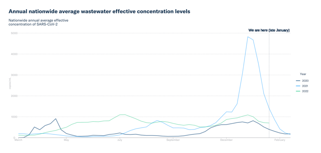
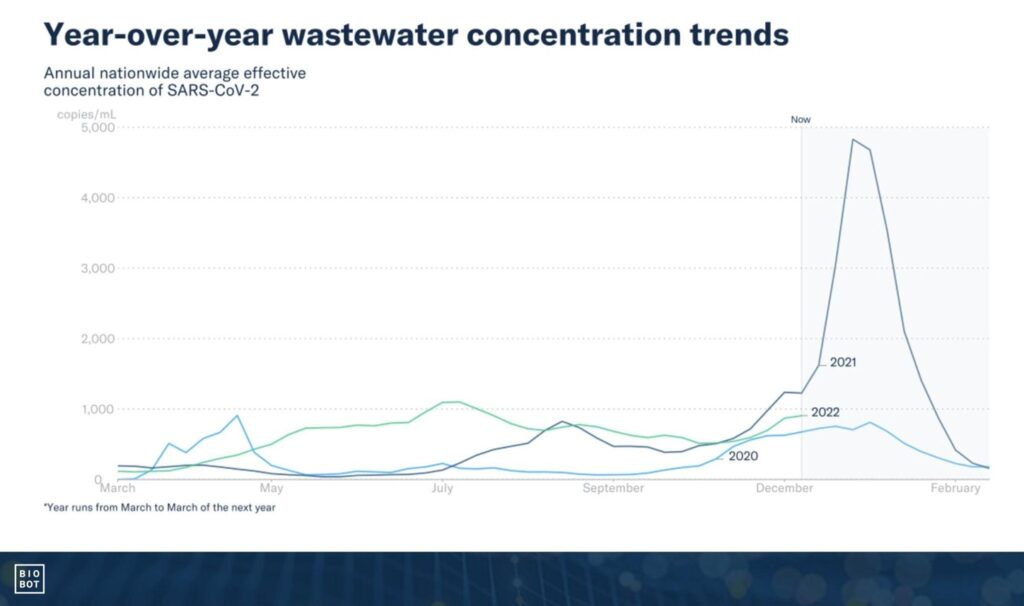
Step 3: Make it tell a story
The final step is to take this now pretty-looking plot, and make it sing a story that anybody can engage with. Up until this step, all of the changes we make can be programmatically implemented. In this final stage, editing can get more complex and we often need to move into another software program to modify details of the data visualization.
There are many great resources online that address how to make data visualizations impactful—here are our favorites that we used to take this plot to the next level:
- Play with color: we made strategic coloring decisions to indicate to the viewers where we want them to pay attention. For example, we used bright (on brand) colors for each year in the plot, and shaded the part of the plot to the right of “now” to emphasize that this is the future for this year.
- Make it easy to view: it’s important to think about the story you’re trying to tell and how you can make it accessible for your audience. In our example, being able to easily identify which line represented which year was very important. To make this more straightforward, we moved the year labels from the legend to the plot itself, directly adjacent to each line.
- Clean up the text: the textual elements in a plot can be just as influential as visual ones. The title is a vital component of any plot — one of the keys we’ve found is to make the title more descriptive and less technical. You can see that our title went from a very technical summary of what the plot was showing (average effective concentrations) to a more generalized description (year-over-year trends). This change effectively highlights the “so what” of the data, rather than the data itself. In addition to a story-driven title, there are lots of other details to consider with the text in a plot — moving labels closer to the data they show, using annotations or callouts if appropriate, removing any extra or jargony text that’s not needed, and so on.
Overall, the goal of this part of the design process is to guide the viewer directly to the point that we’re trying to make with the visualization. There are many stories that can be told by a dynamic and interesting plot, so it’s important to highlight the aspects of the plot that facilitate the story we’re trying to tell. At Biobot, we’ve learned that a simpler plot that tells one story well, is more impactful than an overly complicated plot that tells many stories poorly.
Step 4: Share the plot and learn new things!
At Biobot, it’s really important to us that we share our insights and make our data available to the public. That’s why we started sharing this plot with our community after version 3 was finalized, and then took the extra step to add it as a new toggle feature on our public dashboard where it is updated twice weekly.
We don’t just sit back and relax, though — after polishing a visualization and sharing, new fun begins! We often get interesting feedback from folks who engage with our public data, and we’re constantly working on new and impactful ways to present the data. Sometimes we even surprise ourselves – despite having stared at this data so much as part of our daily jobs, simply presenting it in a new way can open our eyes to insights that we weren’t expecting.
For example, once our team created this visualization, we immediately noticed – wow! – we’ve been higher than the Summer 2021 Delta peak for most of the year! (Interestingly, our team had actually been sharing this tidbit in our weekly data summaries since July, but it really hit home once we made this plot – sometimes it takes seeing something for it to really sink in!) And whoa, that first COVID wave in early 2020 was really high (almost as high as Delta!). And oh boy, we were actually higher in Winter 2022 than we were in Winter 2020, despite our advances in vaccination and treatment. You can read more about these and other insights in our blog post accompanying the launch of this visualization on our website.
That’s the power of building an impactful data visualization: you see your data in an entirely new light, and help others do so too! Follow along for future visualizations and as we expand beyond COVID-19!
Written by Claire Duvallet, PhD
Biobot Analytics’ Founding Staff Data Scientist