Blog
New Variant Visualization Depicting Variant Change Over Time

December 8, 2022


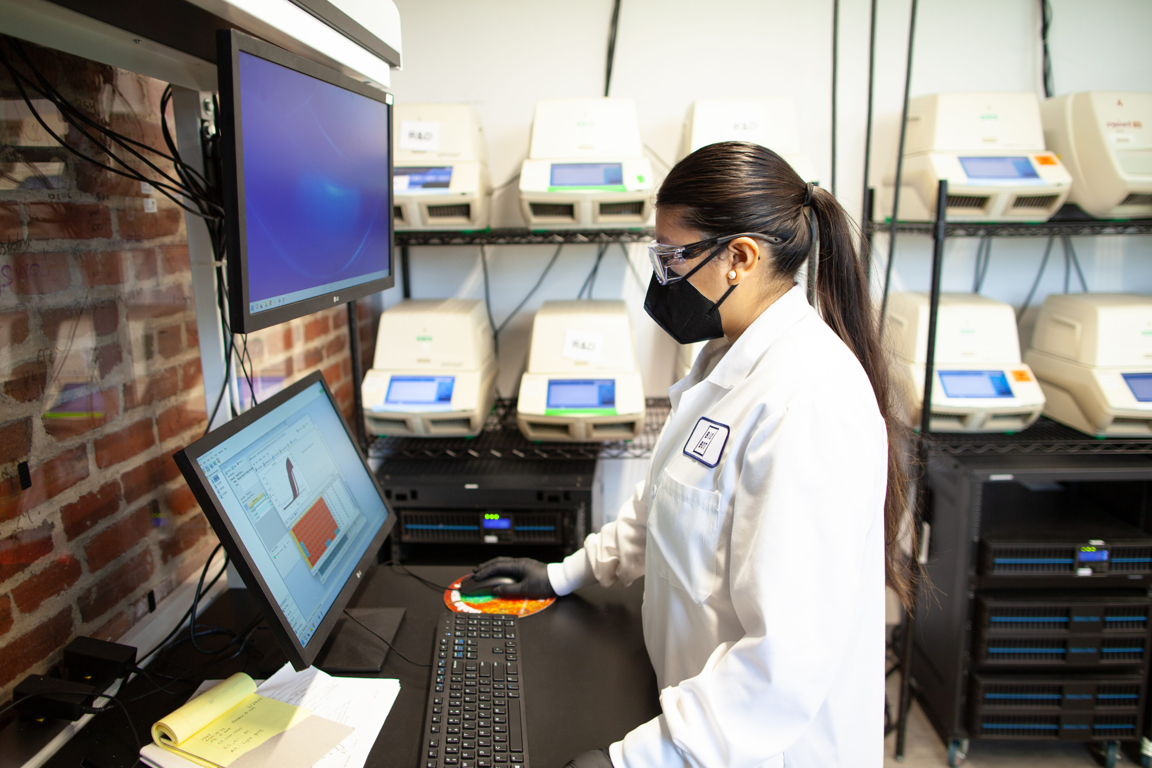
Using genomic sequencing to monitor SARS-CoV-2 variants in wastewater is an invaluable tool to better understand and track the COVID-19 pandemic. Recently, we’ve incorporated major feature updates into our public variant dashboard, which now depicts historical variant data.
COVID-19 variant trends over time
Our new visualization shows the rise and fall of all major variants over the past year. Our variant abundance data date back to December, 2021 when the Delta variant was dominant.

We can see the decline of the dominant Delta variant from over 98% nationwide in early December, 2021, to less than 1% in mid/late January, 2022; the rise and decline of BA.1, BA.2, and BA.2.12; and the rise of BA.5 and BQ.1 more recently. The toggle feature allows you to compare these trends at the regional and national level by switching between the Nationwide, Midwest, Northeast, South, and West views.
How to use the visualization
This interactive chart has many additional features which enable you to explore variant trends over time across the United States. Hovering over the chart reveals variant percentages for each week, and hovering over the variant key illuminates each variant within the visualization. You can also remove a variant from the chart, or view a specific variant of interest in isolation by clicking them on and off from the variant key below the visualization.
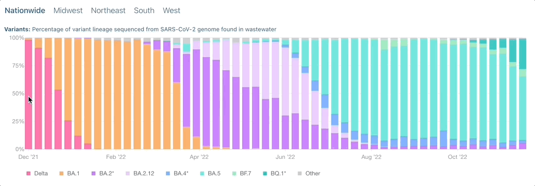

The chart depicts the percentages of the following variants over the past year: Delta, BA.1, BA.2*, BA.2.12, BA.4*, BA.5, BF.7, and BQ.1*. ‘Other’ has been added to represent the summed percentage for all other variants not individually named, and variants with * denote when multiple subvariants are included in a reported variant percentage. View our Variant Report Notes for more information.
More visualizations to come in the New Year
With recent recognition from TIME’s Best Inventions of 2022 and Fast Company’s Innovation by Design, our COVID-19 Wastewater Monitoring dashboard has received global attention. We believe this is an invaluable public health tool and will continue to work on updating and improving our data visualizations as we begin to expand beyond COVID-19. Stay tuned for more in the New Year!
Written by Biobot Analytics
Biobot provides wastewater epidemiology data & analysis to help governments & businesses focus on public health efforts and improve lives.